The design process would hardly be complete without working with colors. The designer can let the material's own integral color–wood, stone, or metal–stand out, or he can cover the object in a completely different shade in order to enhance its beauty or to give it a specific meaning.
vitra.com
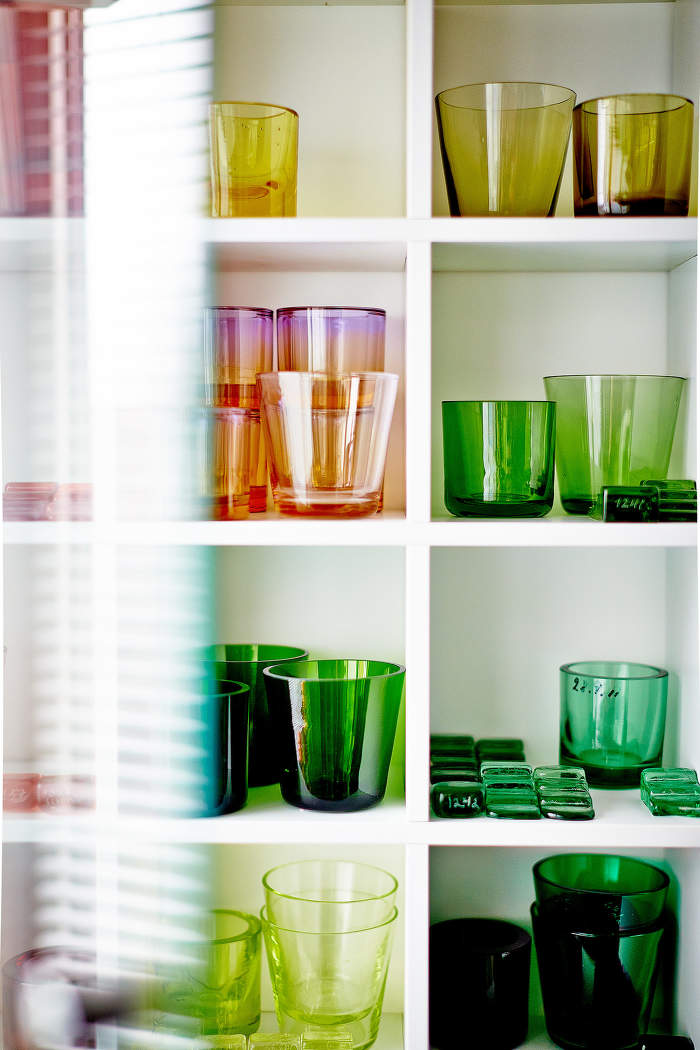
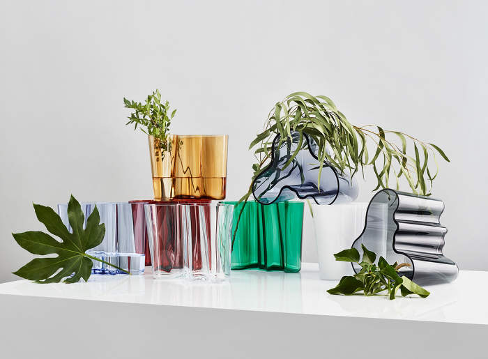
"Colour is the only necessary decoration," Finnish designer Kaj Franck was even heard to say. His minimalist tableware collection, which he introduced under the name Kilta in 1952, included pieces in white, black, blue, green, and yellow. The follow-up line of this iconic tableware, Teema by Iittala, comes not without a careful selection of shades either.
It is this Finnish brand that boasts exceptional knowledge and experience dating back to 1881 when the production of its unique pieces began. Despite the experimenting that goes into making it, the Iittala Glass Factory has developed tens of thousands of colors through the decades. By putting the color in the mass instead of adding it to the surface later, the brand is known for the rich purity of its shades.
The importance of color is also shown by the famous architectural work of Alvar Aalto: Sanatorio Paimio. Every detail of the building was designed in response to need, with the aim of creating a space that would become a comprehensive place of treatment for tuberculosis patients. The carefully chosen shades of the paintings also played a part: yellow to complement the sunlight, red as a warm element, different tones of blue to create a soothing atmosphere in the shared facilities.
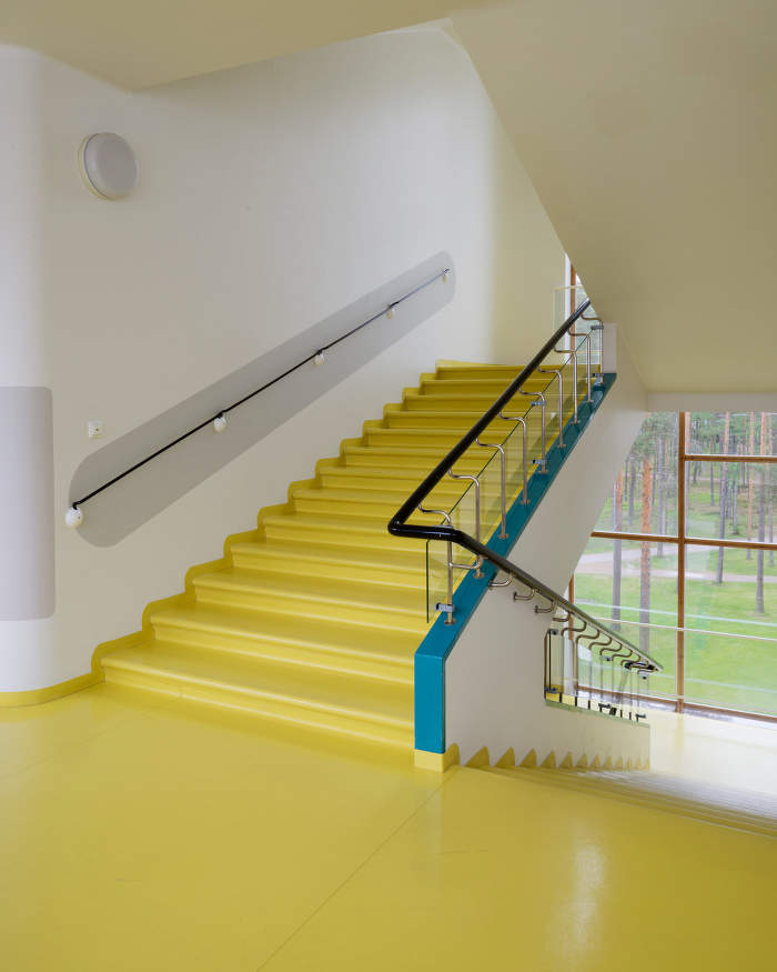
the color plan clearly shows the shades used in each room

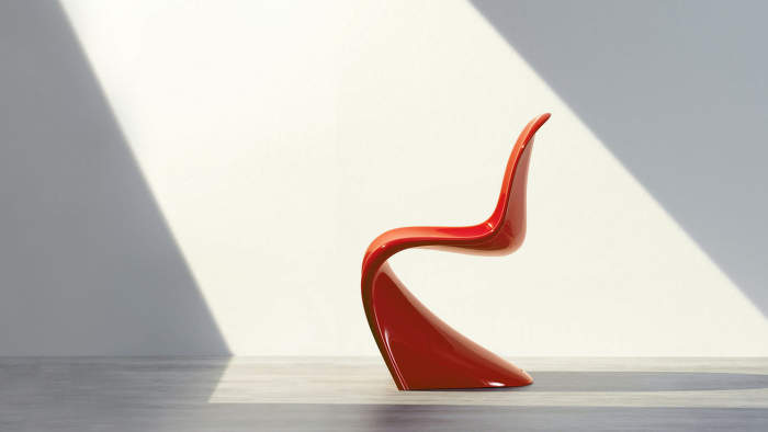
The Danish designer Verner Panton also attributed meaning and function to color. It was his palette of vibrant hues that he used to brighten the ubiquitous grey of Danish homes that made him famous around the world. His rich hues not only covered furniture but entire interiors, from walls to floors to the smallest details.
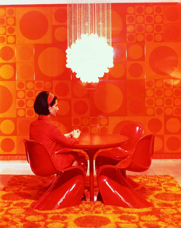
Marianne Panton in Verner Panton's interior, 1970; vitra.com
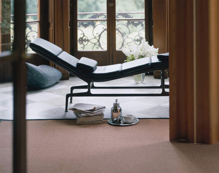
Carefully chosen, though slightly less distinctive, color shades played a central role in the Eameses' work as well. Ray Eames in particular is admired by many for her color sensitivity. She perceived color as not just an aesthetic quality, but as a communication tool. The story of the iconic Eames Chaise is one example of many. The long search for the right shade of metal base only ended the day Ray found the unexpected inspiration–an eggplant which deep purple perfectly complemented the rich black leather upholstery.
eamesoffice.com
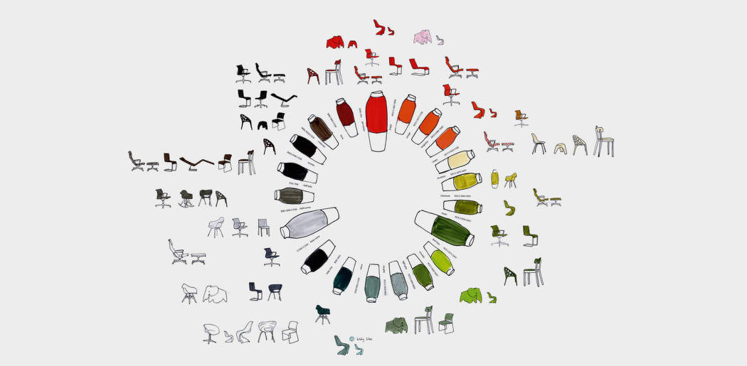
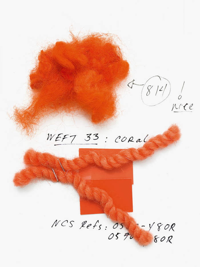
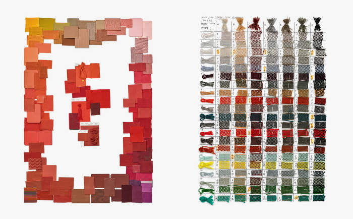
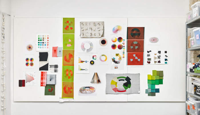
But it's not just the history of design that illustrates the importance of color. Alongside systems such as RAL, with its portfolio of 1,625 unique colors, individual designers and brands have sought to develop their own systems and color libraries from which to draw when creating furniture, lighting, and accessories.
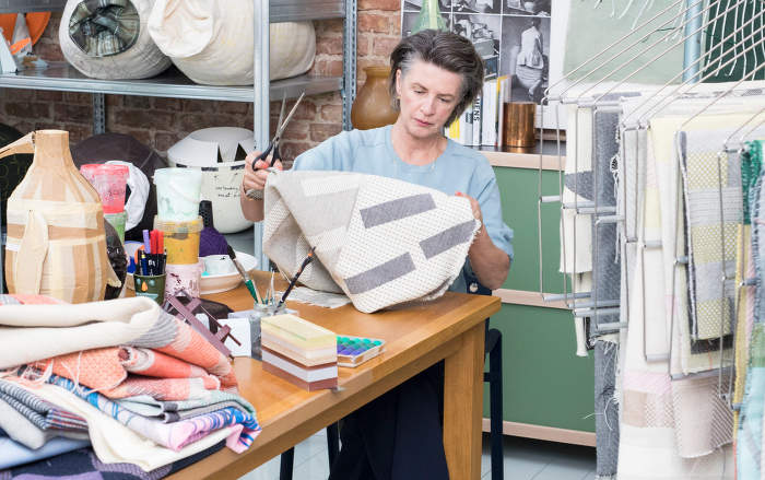
Vitra, for example, has formed a special team of experts, led by Hella Jongerius, to ensure that each new shade is based on a careful analysis of existing ones and that it passes through all durability tests. In addition, the brand's portfolio of iconic pieces by designers such as Ray and Charles Eames and Verner Panton adds an extra challenge–choosing shades in line with the original intent of the famous creators. This is achieved by categorizing signature colors typical of specific designers–for example, light blue for Jasper Morrison, green and burgundy for Ronan and Erwan Bouroullec.
As they are naturally all around us, we can sometimes forget how important role they play in our lives. Colors can change the atmosphere of a place and our mood as well. So, especially when decorating your home, choose them wisely.