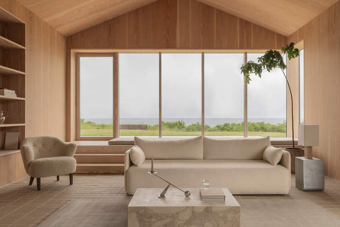
Colours instead of light
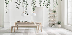
In the Scandinavian countries, light plays a fundamental role, not only in nature but also in interior design. Winter here lasts up to 8 months, during which the sun only appears for a few hours and sometimes not at all. That's why Nordic interiors strike a balance between cosiness and making the most of natural light. Light, natural colours such as white, grey-beige, light grey or sand dominate, making the space visually larger, brighter and calmer. The interior thus becomes a bright sink where one can draw energy on long winter days.
Refracted shades of colour
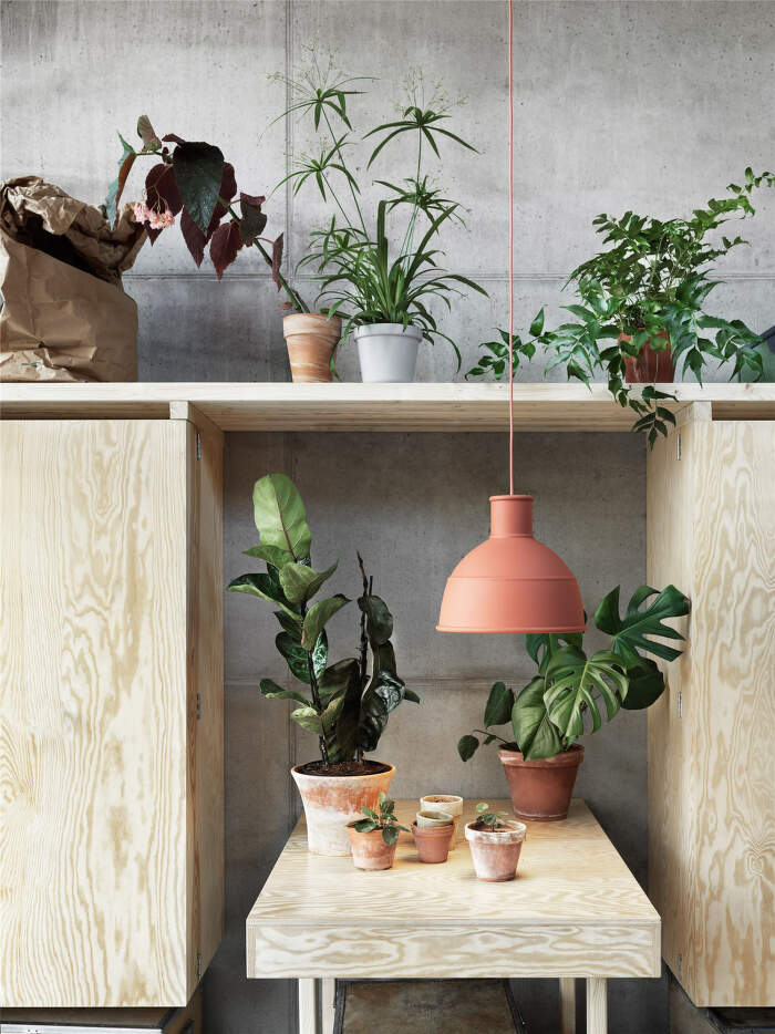
The Scandinavians have a love of nature encoded in their DNA, so the colours used in product design and architecture are fundamentally based on colours that occur naturally in nature.
However, Nordic natural tones are specific. The forests in the Nordic countries have different shades of green than ours and even slightly different than in the Mediterranean. Why? In the north, the sun does not rise too high above the horizon for most of the year. Its rays strike at a lower angle, creating soft and diffuse light. In simple terms, areas further from the equator receive less sunlight than those closer to it. And this affects not only the proportion of green dye in plants, but also that our eye perceives colours differently in different parts of the world.
Light in Scandinavia tends to be cooler (bluish to bluish), especially in winter and spring.
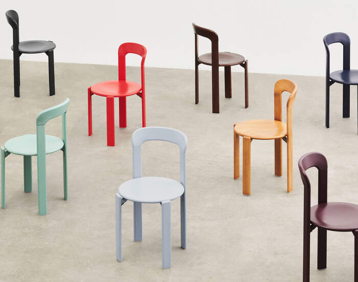
Thus, in nature, cold tones predominate - grey-blue skies, muted green forests, misty landscapes, slate rocks, whitish moss or icy clear water tones. In nature as a whole, earthy, natural tones predominate: sandy, mossy green, dark brown or rust. The typical Scandinavian colour palette is made up of such shades, such as burgundy, moss green, ochre yellow, deep plum, slate blue and others.
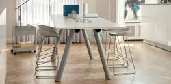
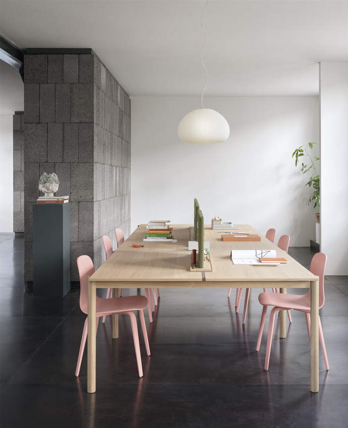
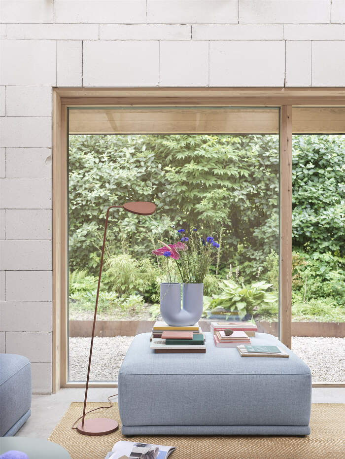
The Scandinavians have also warmly embraced soft pastel tones - pale blue, sage green, light grey or soft pink. The popularity of these tones dates back to the 18th and 19th centuries, when they dominated the so-called Gustavian style inspired by French classicism. Powder shades are beautifully complemented with wood, leather, stone and other natural materials. Working with pastel shades is typical of the Muuto brand, for example.
Designer and visionary Verner Panton
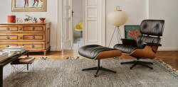
The Danish designer Verner Panton can certainly be described as a pioneer of vivid, bright colours in Nordic design, as he believed that people live a gloomy life, are afraid of colours and therefore need to be presented more.
In the beginning, Panton had a hard time breaking through in Denmark with his distinctive colours. It was only in collaboration with the Swiss brand Vitra that he pushed it through, with one of the designs of the iconic Panton chair (formerly Panton Classic Chair), which carries with it the typical organic shape and colours.

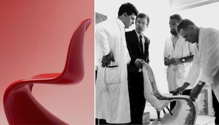
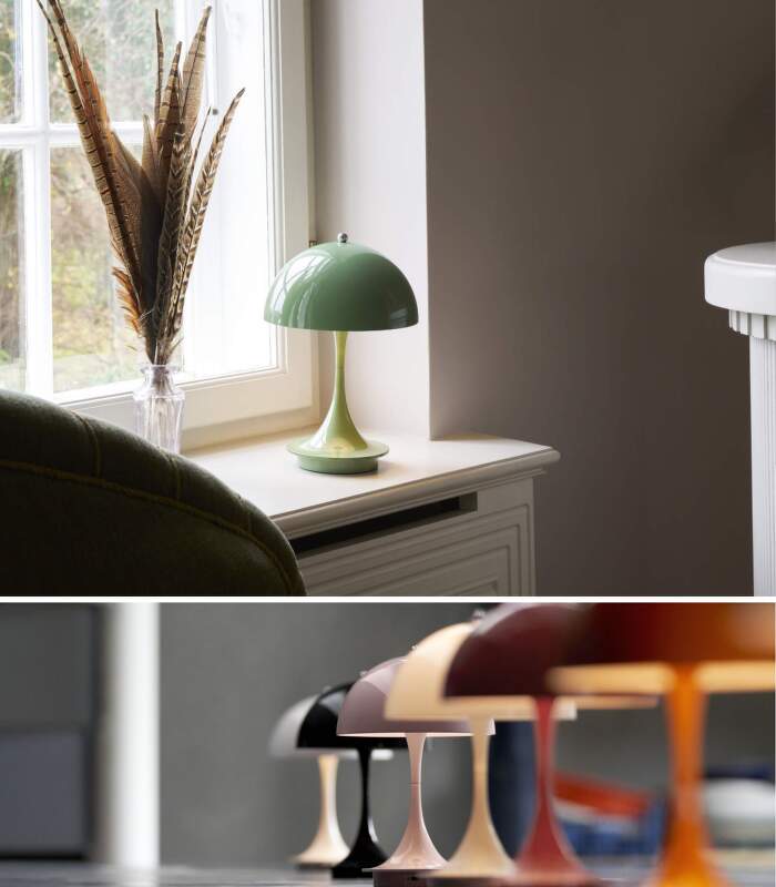
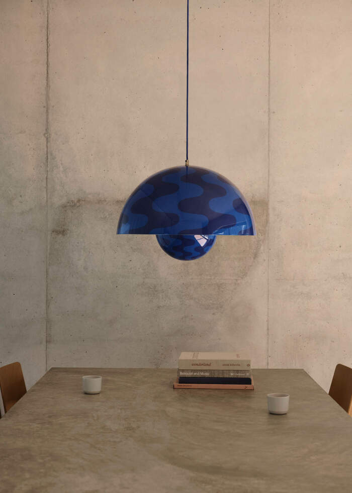
The Danes did not embrace Verner Panton and his revolutionary approach to both materials and expression until much later, but today he is already considered a key figure in Danish design, as evidenced by the Flowerpot collection (now manufactured by &tradition) and Panthella (manufactured by Louis Poulsen). The Flowerpot reissue with the cobalt blue/twilight blue pattern was brought to the market by &Tradition after more than 50 years.
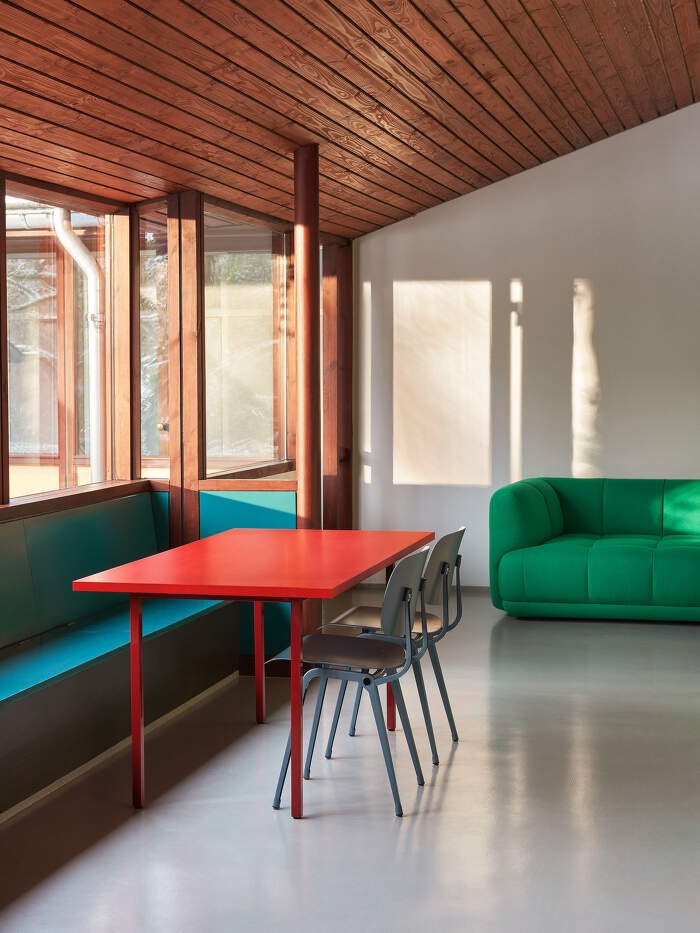
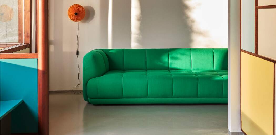
Vibrant colours have become increasingly popular in Scandinavian design in recent years, typical of brands such as HAY, &tradition, Normann Copenhagen, Louis Poulsen, Muuto and others. The market to which Scandinavian brands supply their products has expanded significantly over the last 10 years. And there is a greater demand for colour in Southern Europe, Asia and America. Maybe that's why colours (and not just muted ones) are getting more and more space in Scandinavian product design.
Explore Inspirational Nordic Colour selection and discover the colourful direction of Scandinavian design.